| Listing 1 - 2 of 2 |
Sort by
|
Book
ISBN: 9780500277706 0500277702 Year: 1994 Publisher: Londen Thames & Hudson
Abstract | Keywords | Export | Availability | Bookmark
 Loading...
Choose an application
- Reference Manager
- EndNote
- RefWorks (Direct export to RefWorks)
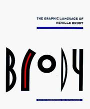
The Graphic Language of Neville Brody" was a tribute to one of the most influential graphic designers of the 1980s. Since then, computer graphics have entered the field of communications and Brody has transformed his typography to create a new "visual language". These new designs are the fruits of five years' experimentation. The Tokyo department store "Parco", the Dutch telecom company PTT, and the German cable TV channel "Premiere" have all commissioned Brody's work. The results appear here alongside his new typefaces: Blur, Pop, and FF Gothic, created for Fontshop International of Berlin, publishers of "FUSE", the inetractive magazine set up by Brody in 1990 as a new forum for experimental typography. Designed by Brody himself, with Wozencroft's text, this is the second instalment in the continuing Brody story.
Graphic arts --- Brody, Neville --- Themes, motives --- Catalogs. --- Graphisme --- Lay-out --- 766.021 --- 766.071 BRODY --- Brody Neville --- Jon Wozencroft --- grafische vormgeving --- twintigste eeuw --- typografie --- 1980 --- -753 --- grafische vormgeving , geschiedenis, grafische vormgevers afzonderlijk

ISBN: 9780500274965 0500274967 0500277702 Year: 1994 Publisher: Londen Thames & Hudson
Abstract | Keywords | Export | Availability | Bookmark
 Loading...
Choose an application
- Reference Manager
- EndNote
- RefWorks (Direct export to RefWorks)
At the age of thirty-one, Neville Brody has been described as 'the most influential designer of the Eighties'. His innovations in graphic design have revolutionized the look of magazines, advertisements and packaging. Whether record sleeve or supermarket packaging, the products paraded for our admiration and consumption as often as not borrow ideas that first saw the light of day on a Brody sketch-pad. While the voracious media boom of the Eighties led others to adapt ideas from Brody's original design, few of his imitators have achieved the same resonance. Brody's work follows his belief in design to reveal, not to conceal. It embraces the dynamism directed by human forms - a challenge to today's ever-growing faith in technology. As such, his work is often experimental; part of a tradition that has its roots in the art movements of the early twentieth century, in particular Dadaism and Constructivism. *The Graphic Language of Neville Brody* collects together much of his output over the last decade, including his ground-breaking design and typography for the international style journal, *The Face*. The accompanying text features many direct quotes and observations on design theory and practice. With over 450 illustrations, this book provides a wide-ranging introduction to a crucial period in graphic design. It gives a first-hand account that will appeal to all those interested in the techniques of visual communication in an increasingly visual age.
graphic design --- typography --- magazines [periodicals] --- record covers --- advertising art --- Brody, Neville --- Graphisme --- Lay-out --- Typografie ; Neville Brody --- Grafische vormgeving ; reclame ; vanaf 1980 ; N. Brody --- 766.07 --- Gebruiksgrafiek ; grafische designers, reclamekunstenaars, typografen, illustrators A-Z --- 766.071 BRODY --- Brody Neville --- Groot-Brittannië --- Text and Captions by Jon Wozencroft --- boeken --- boekomslagen --- grafische vormgeving --- platenhoezen --- tijdschriften --- twintigste eeuw --- typografie --- 1980 --- -753 --- grafische vormgeving , geschiedenis, grafische vormgevers afzonderlijk
| Listing 1 - 2 of 2 |
Sort by
|

 Search
 Feedback
 About UniCat
  Help
Help News
News