
 Search
 Feedback
 About
About Help
Help News
News
| Listing 1 - 1 of 1 |
Sort by
|
ISBN: 3907044878 Year: 2002 Publisher: Baden Lars Müller
Abstract | Keywords | Export | Availability | Bookmark
 Loading...
Choose an application
- Reference Manager
- EndNote
- RefWorks (Direct export to RefWorks)
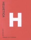
Helvetica is not only the preferred typeface of leading professionals, it is also an all-time favourite among the multitude of codes, signals and signs that flavour urban life. In 1957, Swiss typographer Max Miedinger (1910-1980) came up with “Haas Grotesk”. Renamed Helvetica after 1960, this typeface went on to become one of the world’s most used typefaces ever. It embodies the myth of Sachlichkeit, propagated at the time by Swiss Typography. This book sings the praises of the honest worker and solo entertainer of typefaces, Helvetica, and of its forgotten creator and all those who have contributed to its unparalleled international march of triumph over the past forty years. Filled with pages of color images of Helvetica in use, from album covers and road signs to advertisements and product packaging, the designs gathered together in honor of Helvetica have been created by superb designers and anonymous amateurs from all over the world. The result is an exciting collection of this icon of modern design.
Graphic signs
---
lettertypes
---
typography
---
typografie
---
typefaces [type forms]
---
Lettertypes
---
655.24
---
#BIBC:ruil
| Listing 1 - 1 of 1 |
Sort by
|